 Many people see comics as a bastard hybrid of films and prose, kind of like a movie on a page. While it’s true that studying film and prose techniques will improve your ability to both write and draw comics, it’s also fair to say that comics are a completely different medium, with a unique set of weaknesses, challenges and strengths. Nowhere is this more apparent than in horror comics.
One of the best ways to illustrate this is to look at the techniques that prose writers and filmmakers routinely use to scare their audience that comic creators just can’t utilise. One of the major resources for a horror prose writer is the reader’s visual imagination. No matter how graphic the writer is in their description of a beheading or a disembowelling, the reader will add more details in their mind’s eye and push themselves to the limits of their endurance.
On a comic’s page you have to show all those gory details without leaving the reader any room to add more. With a page of prose the reader is thinking ‘OMG that severed head is spinning through the air and there’s so much blood!’ Whereas with a page of comics, where the action is actually depicted, they may be thinking ‘hmm surely a head wouldn’t spin like that and shouldn’t there be more blood?’ The visceral horror isn’t limited by the reader’s imagination, but by the ability of the artist to depict it.
The impulse jump
One technique that filmmakers often use to scare their audience is to contrive tension and then release it with a shock appearance. You know the routine. The heroine has gone into the basement in search of her boyfriend who’s just been murdered by the maniac. The maniac’s hiding around the corner. The heroine’s just about to turn the corner. The maniac’s raising his axe. The heroine turns the corner. The maniac isn’t there. No wait, he IS there! Boo! AAAH! It’s a simple technique that’s been used to excellent effect by many masters of the genre and no matter how aware we are of being manipulated, it gets us pretty much every time.
In comics this technique is completely redundant. You can’t shock the reader with a surprise appearance because they only have to glance at the bottom of the page, or over to the next panel, for the whole shock to be blown. You can hide the reveal on the next page, but the reader might well have flicked through the comic on the way home to appreciate the art, or simply have turned too many pages at once and seen the image already. Either way it’s a time honoured technique that we comic creators just can’t use.
So comics are more limited in the techniques they can call on to scare the reader, and yet some of the scariest stories I’ve ever read have been comics. The question is how did they do it? How do you bring fear into the funny pages?
I think the best way to answer that question is to deconstruct two of the most frightening classic horror comics I’ve ever read and find out what makes their undead hearts beat.
I balked with a zombie
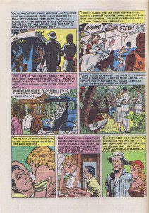
The first story I’m going to look at is Till Death written (most probably) by Al Feldstein and drawn by Johnny Craig. It tells the story of Steve, an American sugar plantation owner who brings Donna, his sweetheart, out to Haiti to marry her. Unfortunately Donna soon succumbs to jungle fever and dies. Overcome by grief, Steve confides to his faithful manservant Jebco that he’d do anything to have her back permanently by his side.
 That night Jebco and his fellow natives resurrect Donna’s corpse in a voodoo ceremony and bring her back to life as a zombie. At first Steve is overjoyed but as Donna’s corpse begins to rot in the tropical heat he is increasingly repelled by the sight and smell of her permanently by his side. Steve tries to put an end to Donna’s presence by shooting her, stabbing her, drowning her and even dropping her from a helicopter into the jungle. But all to no avail, she keeps coming back to his side, looking even more foul each time.
Finally, unable to stand it Steve takes poison and commits suicide, but still his horror doesn’t end. He awakes from death as a zombie, resurrected by his faithful manservant and there, waiting for him, is his rotting zombie bride who will now be permanently by his side for all eternity.
One of the first things that makes this story so effective is that it’s told in the present tense and in the second person. All the way through the story the reader is addressed as ‘you’ forcing them to see everything from Steve’s perspective. This is a technique that is really difficult to achieve in prose, because conventionally all fictional prose is told in the first or third person and in the past tense. If you break this convention you run the risk of alienating the reader and making the horror less real. In comics however, because the text is allied with the pictures it has the opposite effect and actually draws the reader in, letting them live through the story, as it happens, along with the protagonist, making the horror more immediate and real.
The other thing the story does, like all truly great horror, is to take a very real fear from every day life and create a metaphor to explore and heighten that fear. In this case it’s the fear of being trapped in a relationship with someone for whom all love has died and that you now find repellent and suffocating. In comics though, you can turn this metaphor into a potent visual image that really drives the point home. Craig’s depiction of the way Donna’s rotting corpse increasingly decays and how she submissively but steadfastly clings to Steve sums up the death of their relationship far better than any prose could. What’s more, the compressed timeline of comics means the story has far more impact than a film would, due to the time it would take to show Donna’s corpse rotting away.
So despite the limitation of the medium, this story is far scarier because it is told in comic form.
Beneath the streets…the horror!
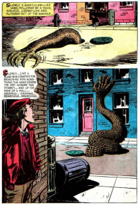
The next story I’d like to look at is the The Monster of Dread End written by John Stanley and drawn by Ed Robbins, you can read the whole thing if you follow the link, and I would urge you to do so. The story starts with a brief history of Hawthorn Place, a once thriving street in the middle of a bustling city, now merely a long row of deserted buildings. Hawthorn Place was the site of a series of child abductions and murders. The children were taken from their homes, often from rooms with locked doors and windows, and their corpses were unrecognisable when discovered. The police were at a loss to do anything and eventually all the residents packed up and moved out.
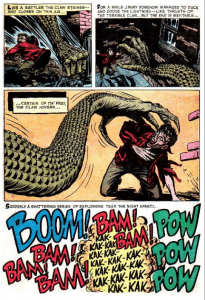
 Seven years later Jimmy White, brother of the first victim, returns to the street determined to find the killer at all costs. He stakes out the street but by five in the morning he’s seen nothing. As Jimmy decides to leave he sees a long reptilian arm, with a huge claw on the end, snake its way out of the sewer like a serpent. This is the monster that’s been abducting the children. Jimmy tries to run but the arm pursues him chasing him through the back alleys. Then, just as the arm is about to strike it is mown down in a hail of gunfire.
The police have been staking out the street too, waiting for their opportunity to catch the monster. Thanks to Jimmy they have found it. A forensic scientist examines the giant claw and determines that the monster fed off the children by crushing their bodies then absorbing them through the huge pores in its palm. The monster’s reign of terror is finally ended.
Once again the story creates a fantastic visual metaphor for a very basic primal fear. In this case it’s the fear that beneath the everyday world of our streets and houses lies an ancient primal force that can pluck us out of our beds and take us when we are at our most vulnerable, and not even the comfort and security of our homes and our parent’s care can protect us from it. Nothing can more perfectly embody this fear than a huge reptilian hand that rises from the sewers at night and reaches into the bedrooms of sleeping children.
What makes this story even scarier is the fact that we never actually see the full horror either of the monster or its victims. As I stated earlier, comics can’t compete with the graphic descriptions of prose or the special effects budgets of film, so this story doesn’t even try. The final gunfight is depicted only as a panel filled with sound effects. The monster itself is never fully seen, only its hand and arm. Even the bodies of the monster’s victims are not shown in the early part of the story. There is always an innocent bystander, or a crowd blocking our view. The captions refer to each body merely as a “balled up thing … like an empty wrapper thrown carelessly aside”. When later we learn that the monster crushed their bodies and fed off their bodily fluids the state of their corpses is almost too terrible to picture. All the horror takes place off the page where our imagination is every bit as vulnerable as those sleeping children.
The horror of it all
It would seem then, that there are a few key things that make a horror comic truly scary. One of the main things is a central visual metaphor that symbolises a very basic human fear and depicts it in a way that no other medium can. Another thing would be the ability to place the reader directly into the mind of the protagonist through the use of ‘second person – present tense narrative’. In this way the horror becomes more immediate and far more personal than in any other medium.
Finally, even though horror comics are a graphic medium, what they don’t show you is far scarier than what they do. The worst horrors of all lie just outside the panel borders, in a place so terrifying not even the most foolhardy would dare to explore.
JASPER BARK


3 comments
Being able to see a whole comics page can limit its effectiveness at scaring you. I think that’s one of the advantages of digital comics, particularly on smaller handheld devices. As you can only see one panel at a time, it’s possible for the writer to build tension leading up to a big reveal, similar to the way films create their scares. It’s also why humour comics work well in digital form – you get the set up without seeing the punchline.
Very good point Peter. The view in the comics industry is that the digital comic will eventually have as great an impact on the medium as the comic book did on the comic strip. When comics ran in the papers they ran in strips whee all the panels were of equal size. The comic book page allowed for much more dynamic layout and design t due to variable panel shapes. Artists like Jack Cole and Jack Kirby in particular embraced this change and pushed the envelope. Now comics are no longer limited to pages that you read from left to right and top to bottom one at a time, the potential for new story telling devices is immense.
Peter is right, in my online graphic novel. I like the fact that people can not peak into the next panel. But this has been the same with the originals in my moleskine: One picture per site.
Good insides in a comic readers mind. Scary things can hide in a mess and often the horrible things lurk beneath the surface in the darkness.